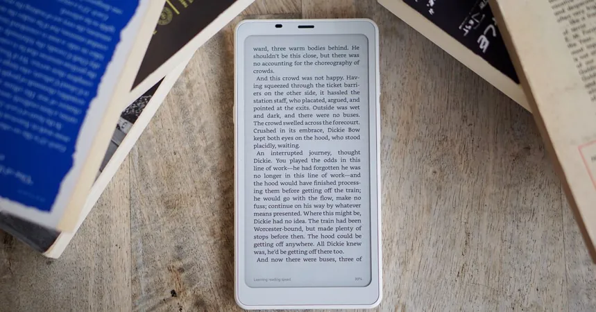
Boox Palma 2 Review: A Familiar Face with Some Upgrades
2024-11-24
Author: Jessica Wong
Introduction
The Boox Palma 2 has arrived, but it’s hard to overlook the fact that it retains much of the essence—both good and bad—of its predecessor. Launched a little over a year after the original model, which I have used and cherished daily, this new e-reader is fundamentally the same.
Pros of the Boox Palma 2
On the bright side, consistency can be advantageous. The Palma's charm lies in its simplicity. This compact device, akin to a smartphone, offers easy access to the Google Play Store and features an E Ink screen that is gentle on the eyes and lasts days without a charge. For those who prefer a straightforward way to read books, documents, and web content, it stands alone in its effectiveness. Personally, it has become not just a reading device but also a platform for music, podcasts, and quick notes—keeping me away from my phone's chaos.
Performance and Upgrades
One primary concern I had with the original Palma was its longevity. Running on an older chip with Android 11, I worried about its future. Thankfully, the Palma 2 features a newer chip and operates on Android 13, which should provide a few years of security updates—though Onyx has a reputation for prioritizing new releases over existing device support.
Despite the promised improvements from Onyx, such as a 'faster octa-core CPU,' I struggled to find noticeable upgrades in day-to-day use. While benchmarks suggest slight improvements, particularly in graphics, the real-world application feels similar to the original. Apps still take a beat longer to load than ideal, and there are occasional hiccups with touch responsiveness. Playing games or streaming videos? Forget about it. To put it in context, the Palma 2 benchmarks at the level of a decent midrange phone from 2019—a step up but still lagging behind more recent competitors.
Design and Features
From a design perspective, not much has changed. The Palma features the same 6.3-inch E Ink Carta display, which remains visually pleasing, and the plastic casing still feels a bit flimsy. It retains 6GB of RAM and 128GB of storage—adequate for its intended use. The 16-megapixel camera does the job for scanning documents but falls short for non-document photographs. The power button has been enlarged and now includes a fingerprint reader for added security; while a nice touch, it operates a bit slowly and leaves one wondering if security is needed for such a device at all.
Battery Life
The battery life is as impressive as ever, lasting four to five days per charge, just like its forerunner.
Critique and Missed Opportunities
While I appreciate that the Palma 2 delivers on my expectations, I can’t help but feel it’s a missed opportunity. Onyx could have taken bolder steps: introducing a SIM slot to transform the Palma into a minimalist smartphone, improving materials to elevate the quality, or refining the Android experience by simplifying settings and eliminating unnecessary built-in apps. Alternatively, they could have offered a stripped-down version at a significantly lower price.
Conclusion
Ultimately, the Palma remains true to its origins. Existing Palma users won’t find compelling reasons to upgrade, but newcomers should lean toward this version for its longer warranty of longevity. It resembles the Kindle experience: while upgrades year after year seem minimal, the device remains a reliable choice for those in need.
I hope to see the Palma face more competition in the market. The combination of a smartphone size, E Ink display, and Android apps is straightforward enough for other companies to innovate and potentially improve. As it stands, there are alternatives but none have yet captured the essence of this concept effectively.
For now, the Palma 2 suits my needs well—it’s perfect for reading and organizing my audio content while keeping distractions like TikTok at bay. It’s a winning combination in my book!


 Brasil (PT)
 Canada (EN)
 Chile (ES)
 España (ES)
 France (FR)
 Hong Kong (EN)
 Italia (IT)
 日本 (JA)
 Magyarország (HU)
 Norge (NO)
 Polska (PL)
 Schweiz (DE)
 Singapore (EN)
 Sverige (SV)
 Suomi (FI)
 Türkiye (TR)